 Back
Back[UX/UI, web]
Medgal — Product Catalog & Information Architecture
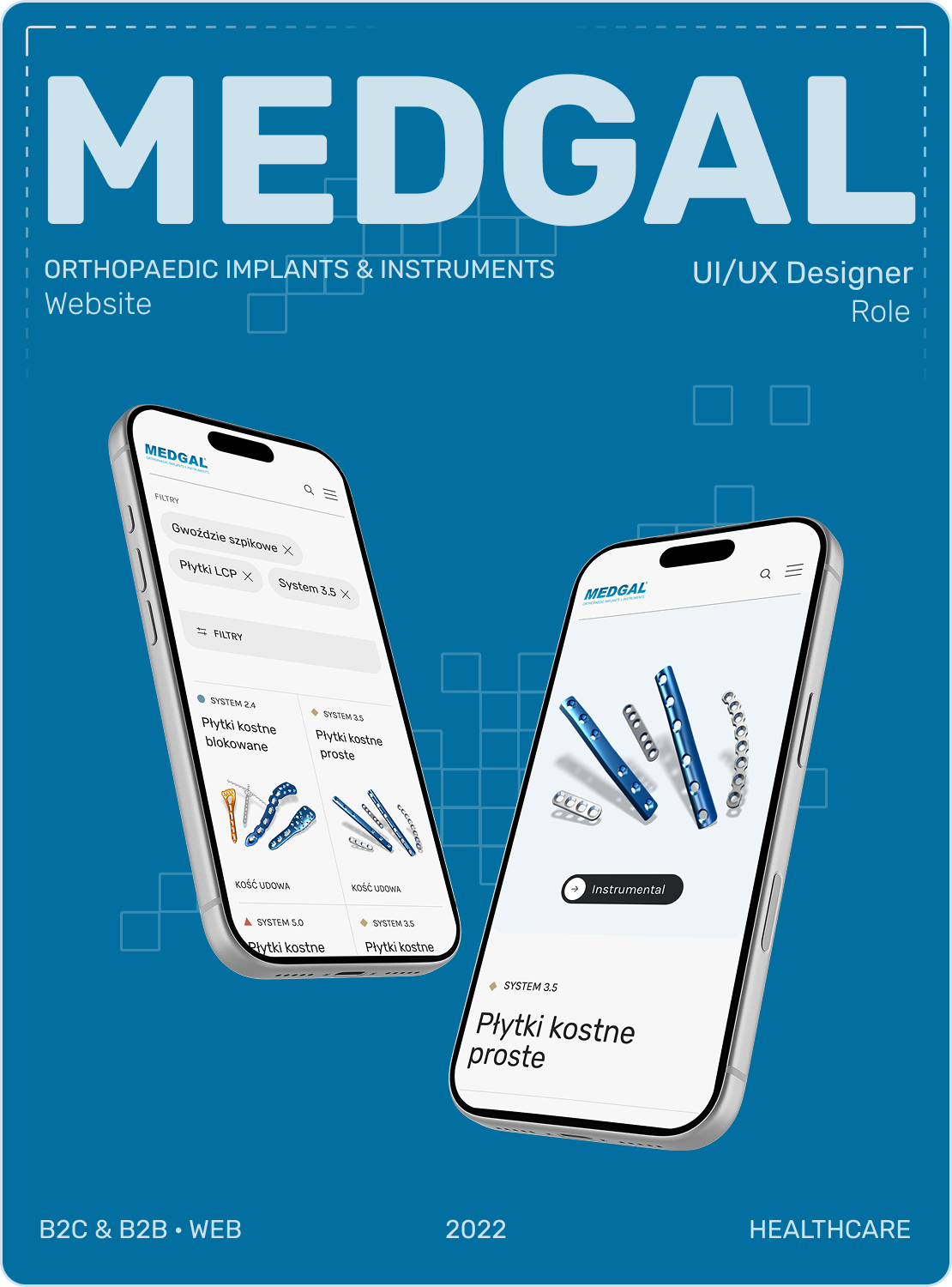
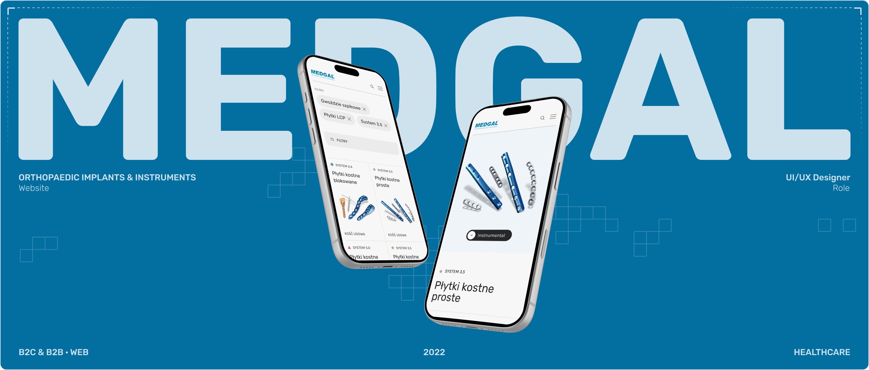
Replaced a static PDF catalog with a searchable system for a large, technical product range.
Year
2022
Role
UI/UX Designer
Scope
UX Research · IA · UI Design
Type
Healthcare · B2C & B2B · Web
A product range too complex for a static catalog
Medgal manufactures orthopedic implants and instruments — hundreds of products across multiple systems, generations, and anatomical areas, sold to distributors, surgeons, and patients across Europe. As sole end-to-end designer, I replaced a fragmented experience — category pages on the site, detailed product data locked in separate PDF catalogs — with one searchable, filterable system. The same principle — one clear path per need, not a static document — carried through the rest of the site.
Medgal manufactures orthopedic implants and instruments — hundreds of products across multiple systems, generations, and anatomical areas, sold to distributors, surgeons, and patients across Europe. As sole end-to-end designer, I replaced their PDF-only product catalog with a searchable, filterable system built to handle that complexity. The same principle — one clear path per need, not a static document — carried through the rest of the site.
Core problem
A product range this large and technical could be browsed by category, but finding and comparing a specific product meant leaving the site for a separate PDF catalog.
The business had grown. The digital experience hadn't
I audited the existing site and reviewed five direct and indirect competitors. Despite operating through an extensive distributor network across Poland and Europe, the company — like most of its competitors — still split product discovery between category pages and separate downloadable PDF catalogs. None of the five competitors let visitors browse from a category all the way to an individual product on the website itself. This revealed a clear gap between the scale of the business and the digital experience available to its customers.
The challenge wasn't adding products. It was making them findable
The product range itself was the hard part: hundreds of implants and instruments with technical names that meant little outside the company, and no obvious way to browse them. I validated the catalog’s structure through card sorting rather than guessing at a hierarchy — categories, system names, and anatomical terms had to make sense to someone outside Medgal, not just to internal staff.
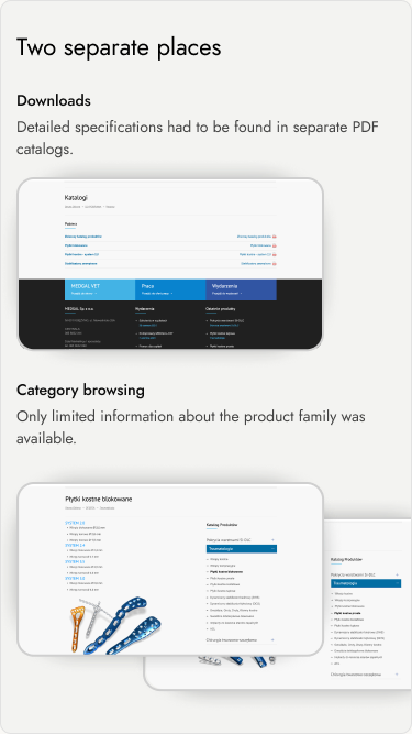
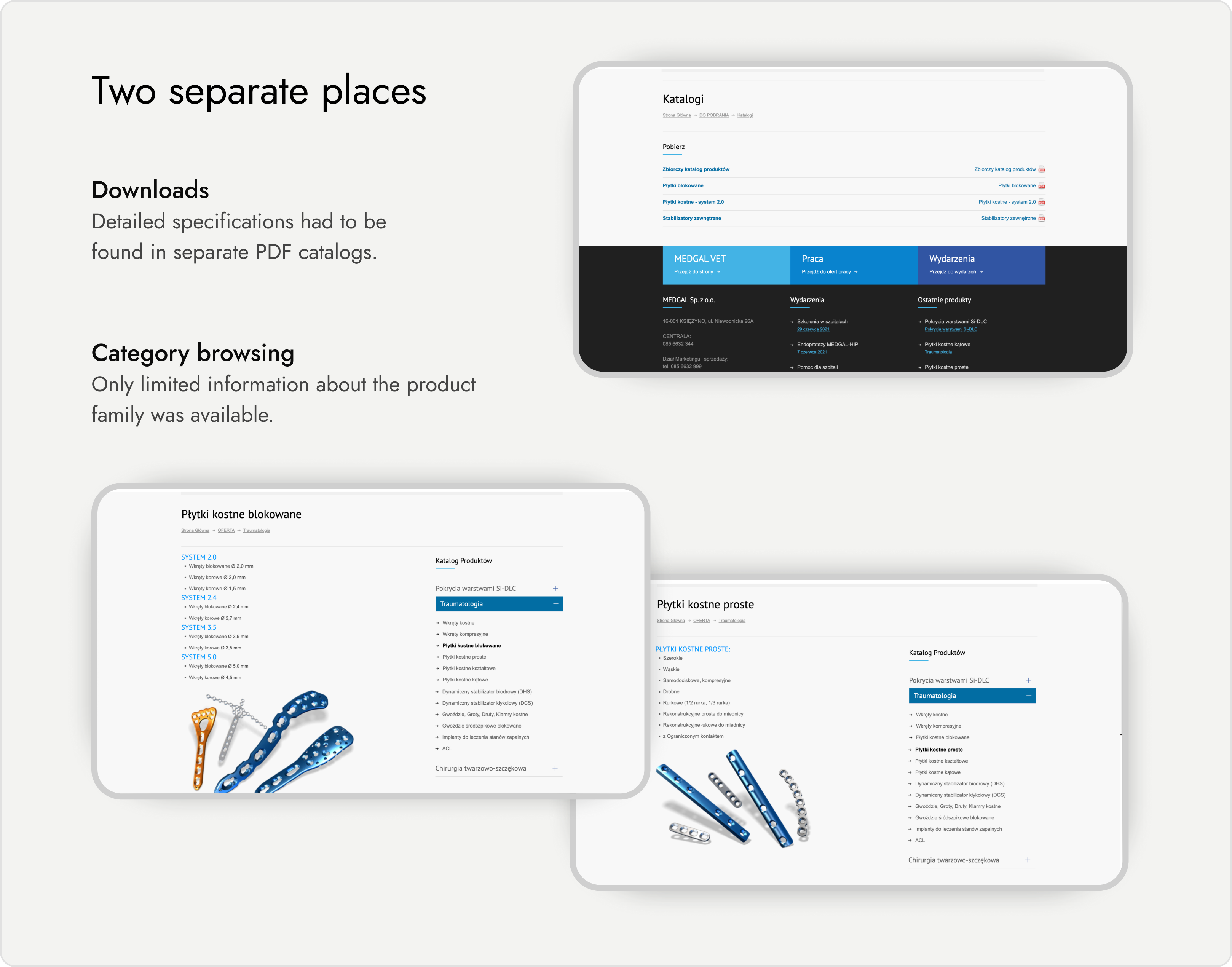
BEFORE — Product discovery was split between the website and PDF catalogs.
The website helped users find a category. Detailed product information lived elsewhere.

AFTER — Multiple paths to the right product
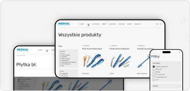
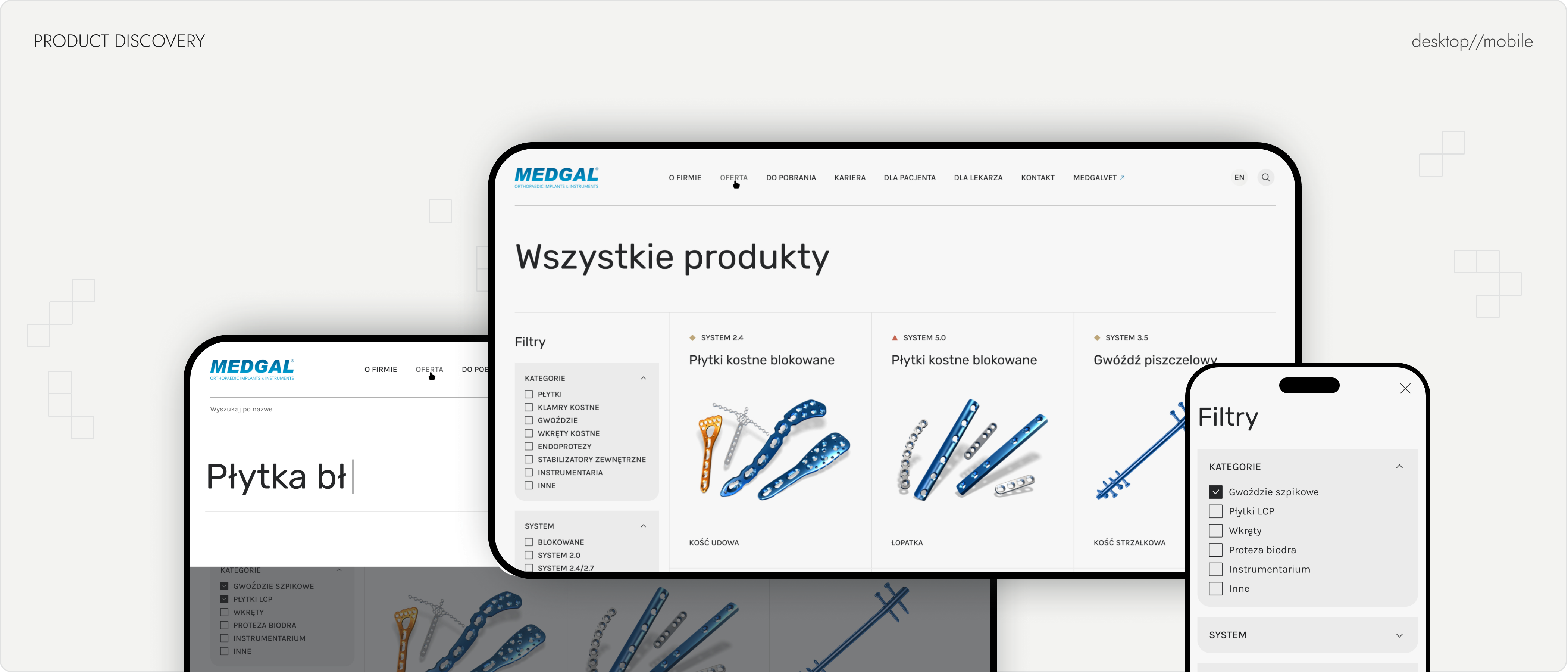
Users can start with what they know — a product type, system, or body part — and progressively narrow the catalog to the right product.
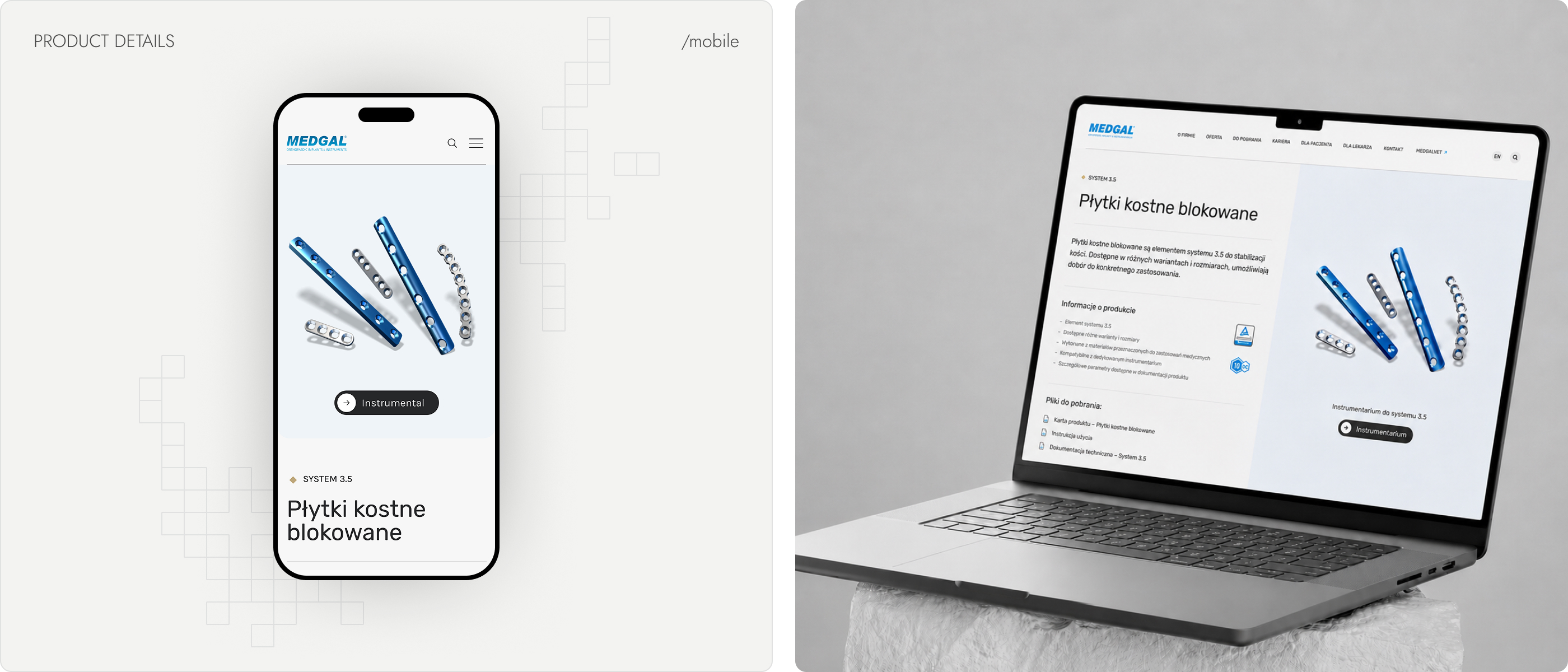
Finding the right product shouldn't require knowing its name
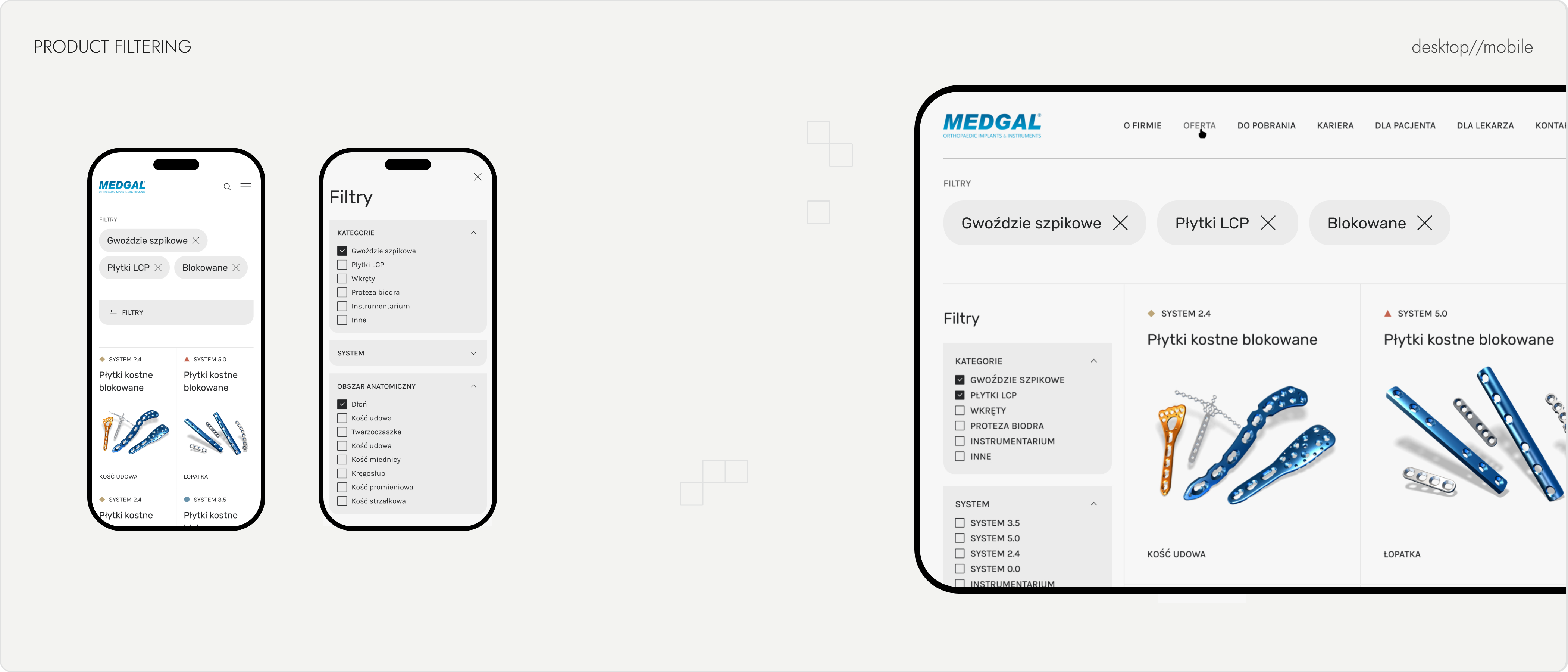
The catalog had to make a genuinely complex product range easy to navigate, so I designed a filtering system around three dimensions: product category (e.g. bolts, plates, screws), system/generation, and body part. Users could start from any dimension and combine filters to progressively narrow the results — for example, starting with a body part and then refining by product type and system to find compatible products. Active filters were surfaced as removable pills above the results, making the current selection visible and easy to adjust.
Because the product range was difficult to navigate by name alone, search became a second primary entry point rather than an afterthought. Product pages then supported the final decision with full specifications, downloadable data sheets, and compatible implants from the same system, allowing surgeons and distributors to confirm fit without leaving the page.
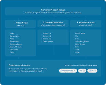
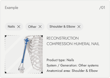
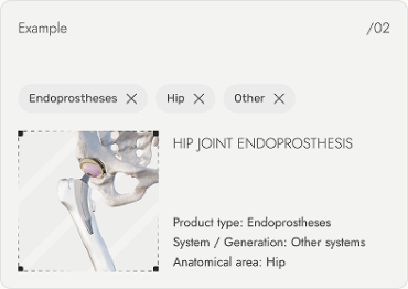
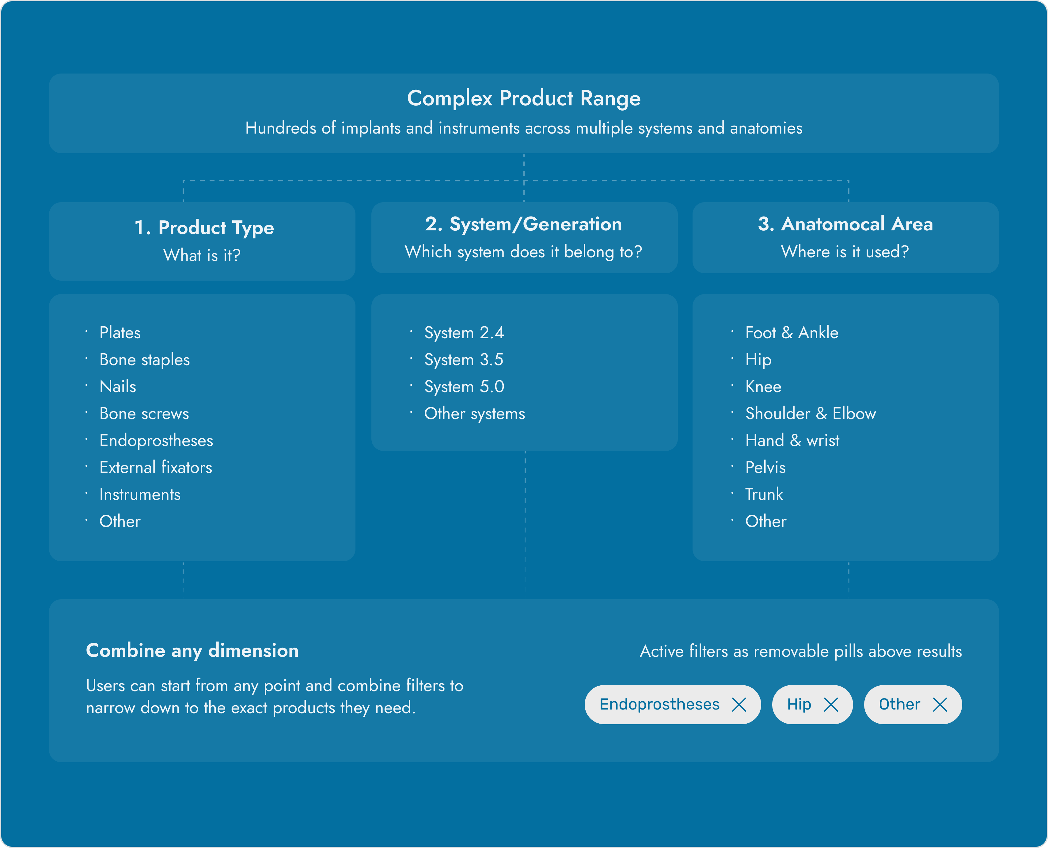
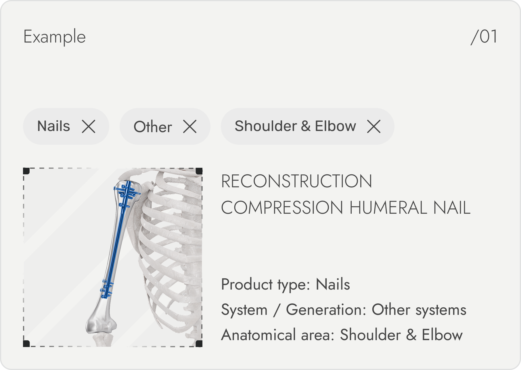
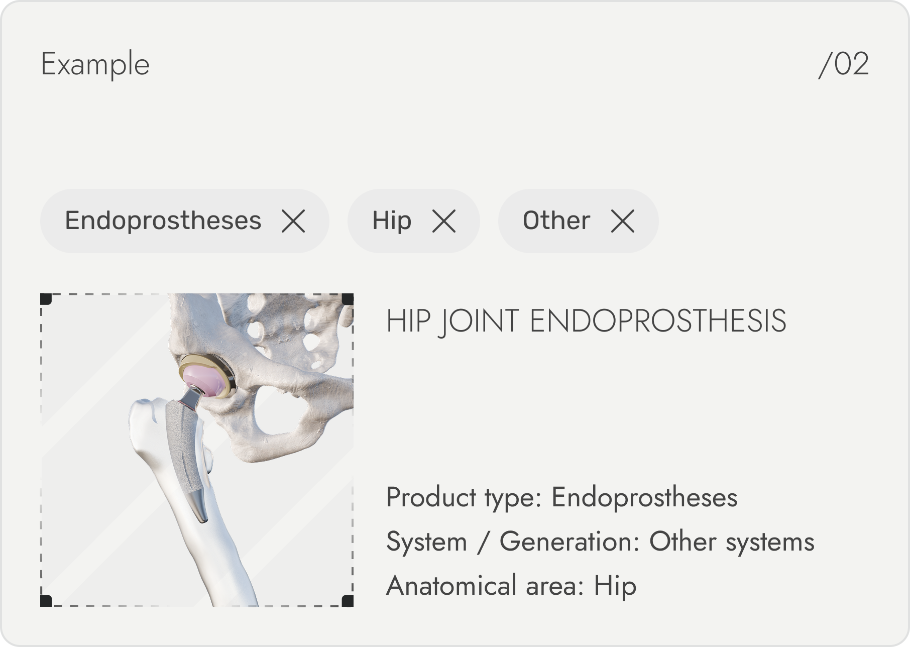
One catalog, multiple paths to the right product
I structured the catalog around three key parameters — product type, system, and anatomical area — allowing specialists to combine them in any order. This reduced a large, technical product range to a relevant set of compatible options without requiring users to know an exact product name.
Whether someone starts from a body part, a system generation, or a product type, they land on the same filtered results — with active filters visible and adjustable at every step, not buried in a sidebar.
Extending the system beyond the catalog
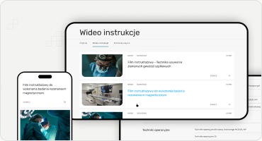
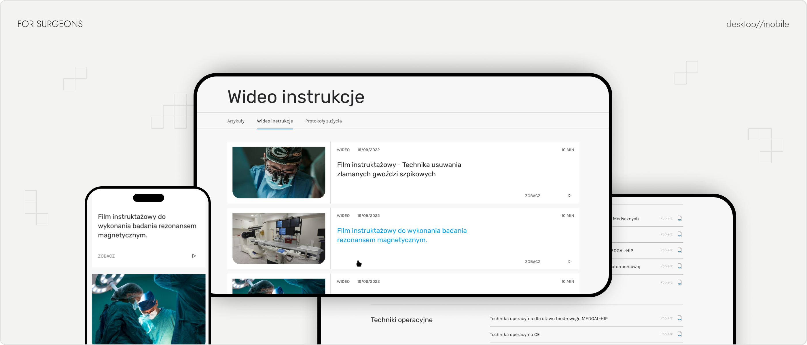
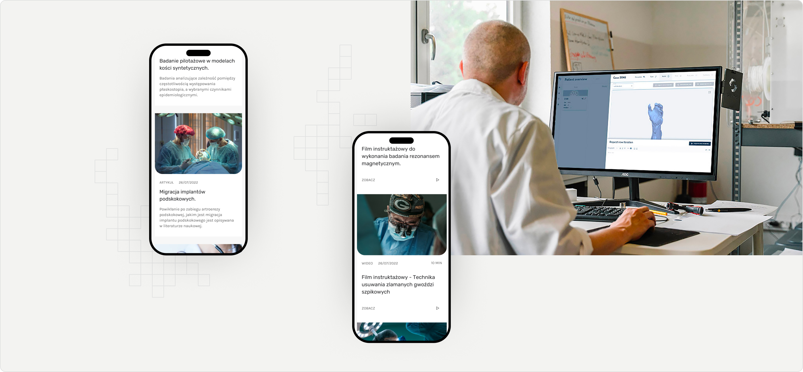
Surgeons needed fast access to procedure videos, technical guides, and downloadable documentation — content that didn’t belong in the product catalog but still had to be easy to reach. It got its own dedicated space instead of being scattered across generic pages.
One system, applied consistently
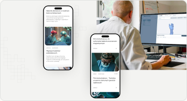
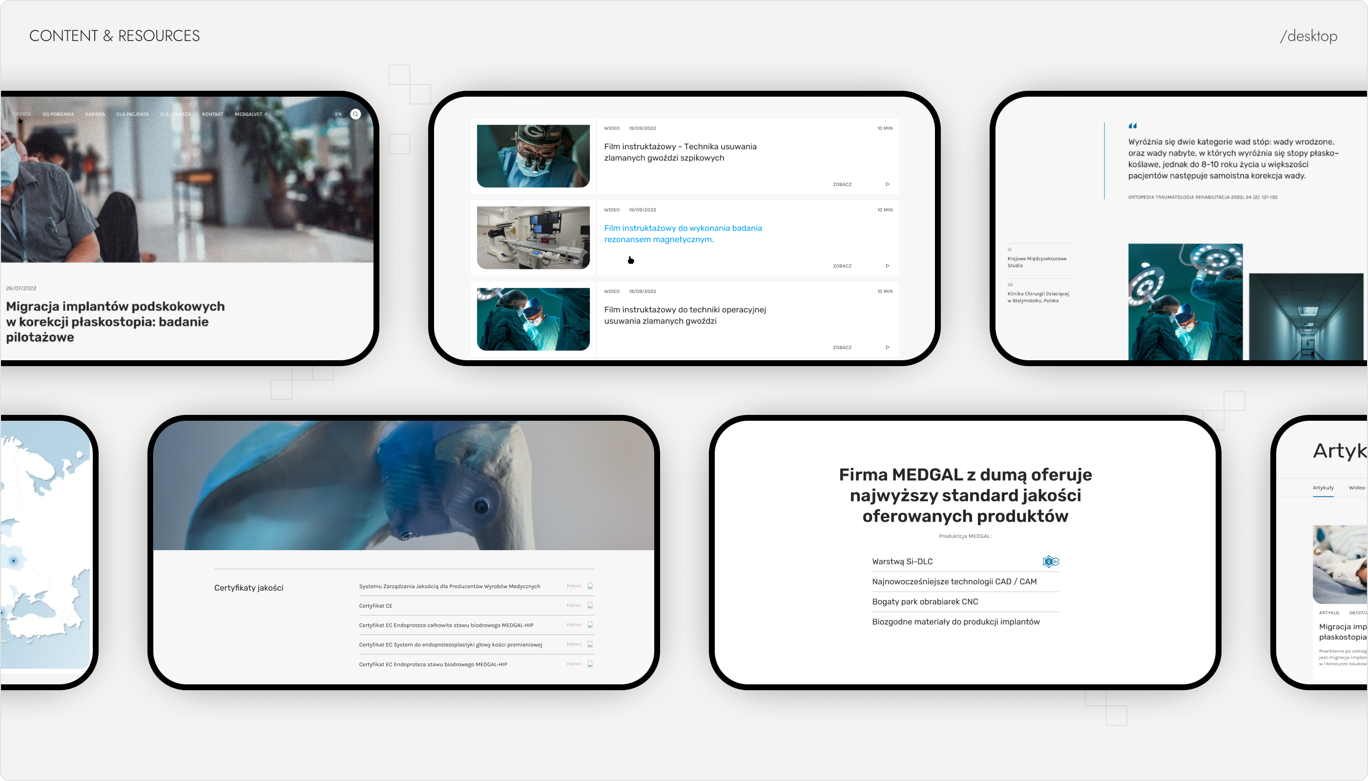
The same logic — a clear entry point instead of one dense page — carried through the rest of the site: documentation for surgeons, plain-language articles for patients, certifications and downloadable files kept together instead of buried in menus.
From a static website to a structured product experience
The redesign addressed the core structural problem: a large, technical product range where browsing stopped at the category level, with product-level detail locked away in separate PDFs. Products moved from static PDF catalogs into a searchable system with three-dimension filtering, and that same structure — one clear path per need — extended to documentation, patient content, and distributor inquiries. The result was an information architecture built around how people actually look for a product, not around the company’s internal categories.
01
100+ products made searchable in one catalog
02
Fragmented → Unified One browsable product catalog
03
Filtering across 3 key product dimensions
Complex products need more than a clear interface
This project reinforced how much of a complex digital product is defined before the interface itself. The real challenge wasn’t visual design — it was turning a large, technical product range into something people could navigate without knowing exact product names. Building the filtering logic taught me that strong information architecture isn’t about organizing content into categories; it’s about giving people multiple honest ways into it.
next
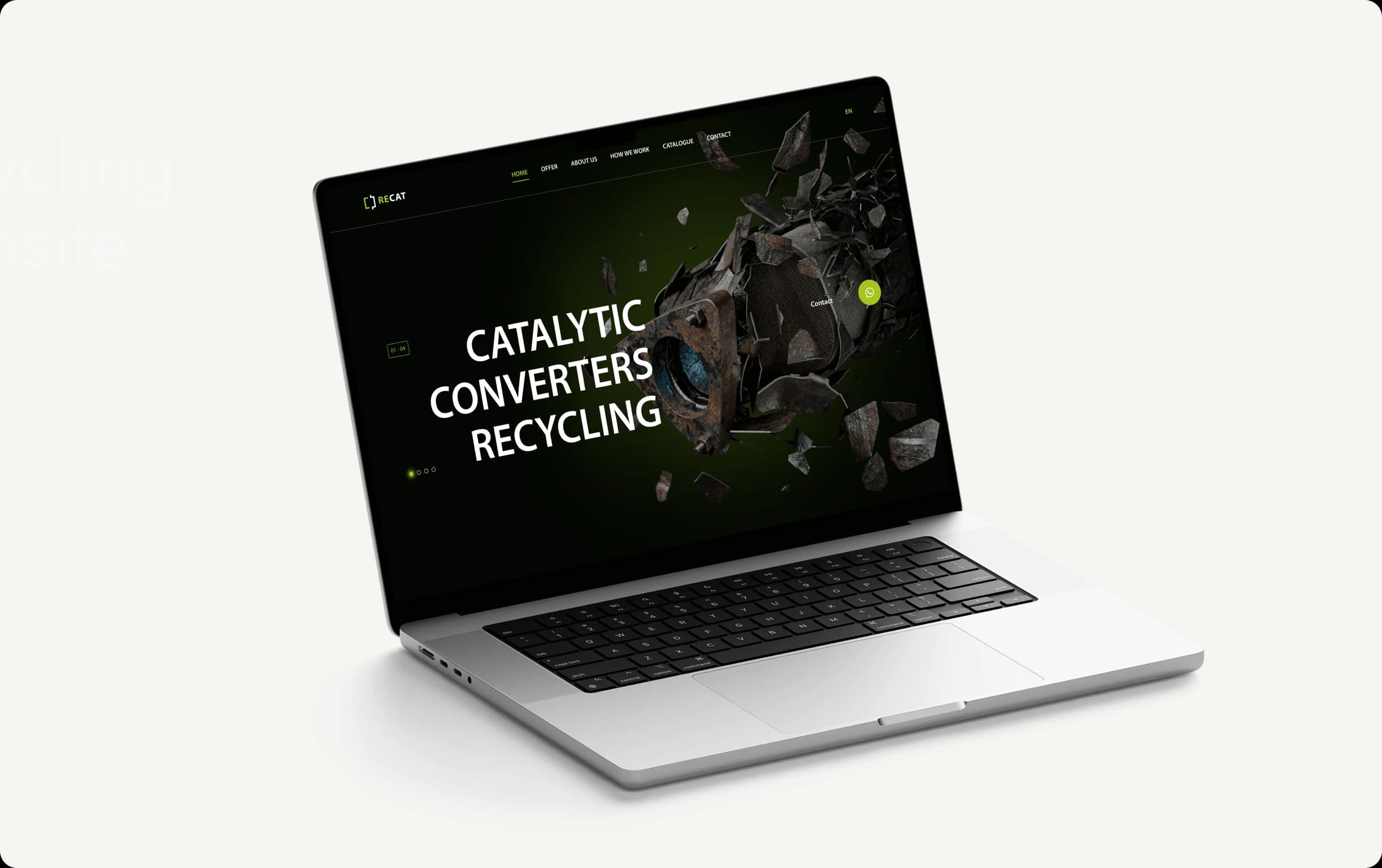
RECAT — Recycling Company Website
WhatsApp lead flow integrated with CRM for a technical B2B recycling service.
Previous
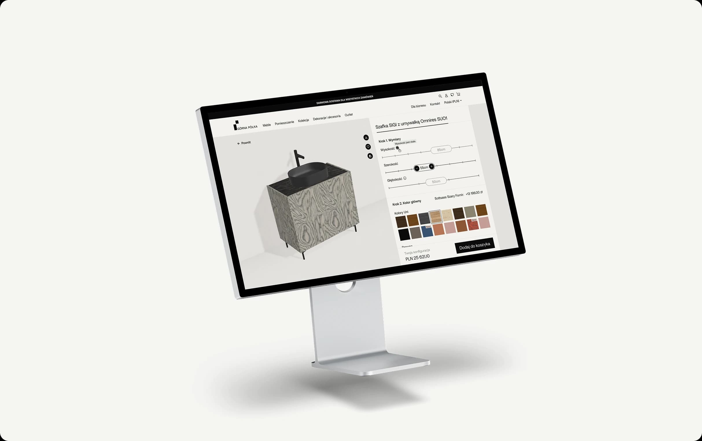
Górna Półka: E-commerce & Configurator
End-to-end redesign of a multi-market furniture e-commerce platform.
next
RECAT — Recycling Company Website
WhatsApp lead flow integrated with CRM for a technical B2B recycling service.