 Back
Back[UX/UI, web]
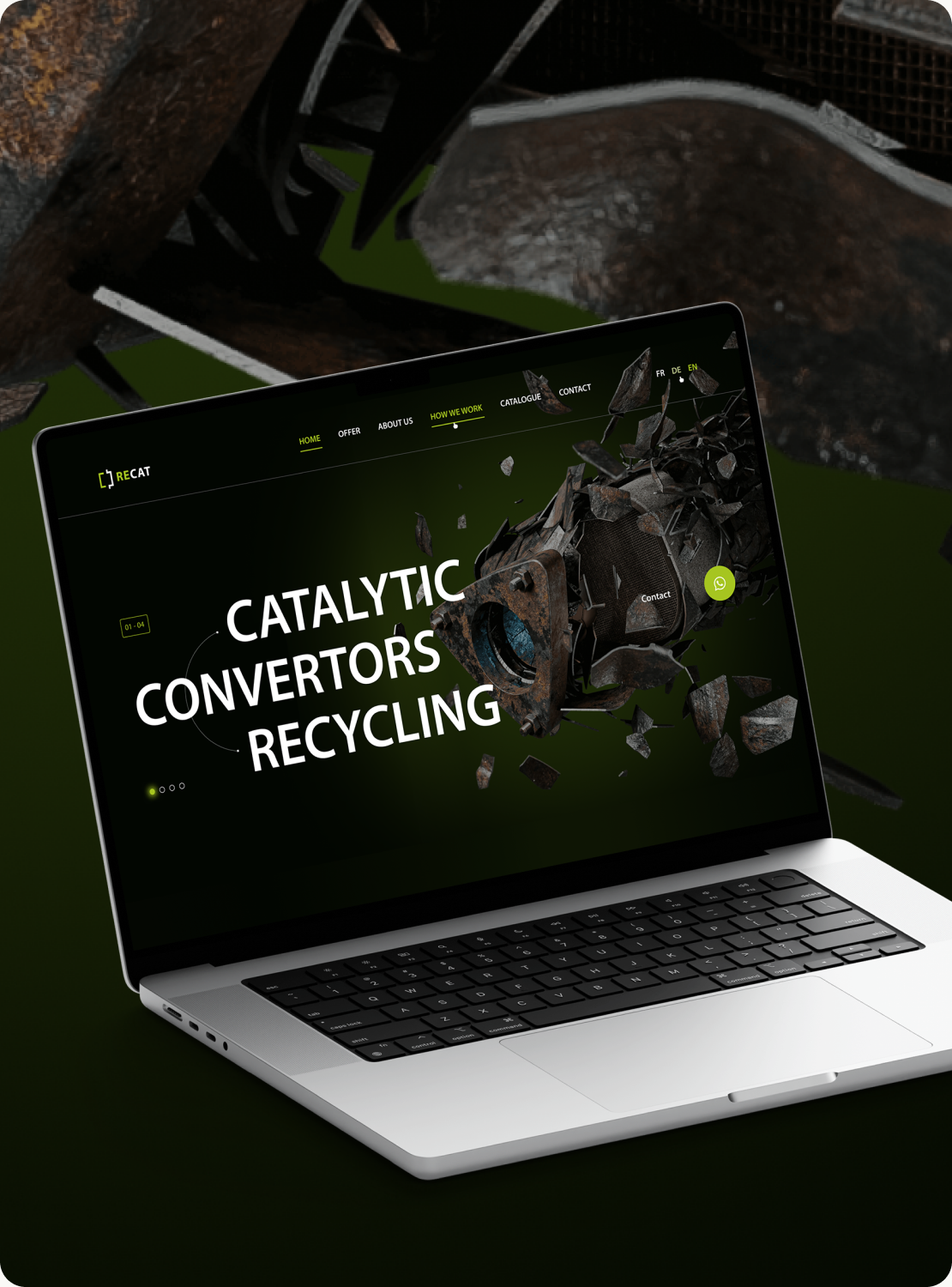
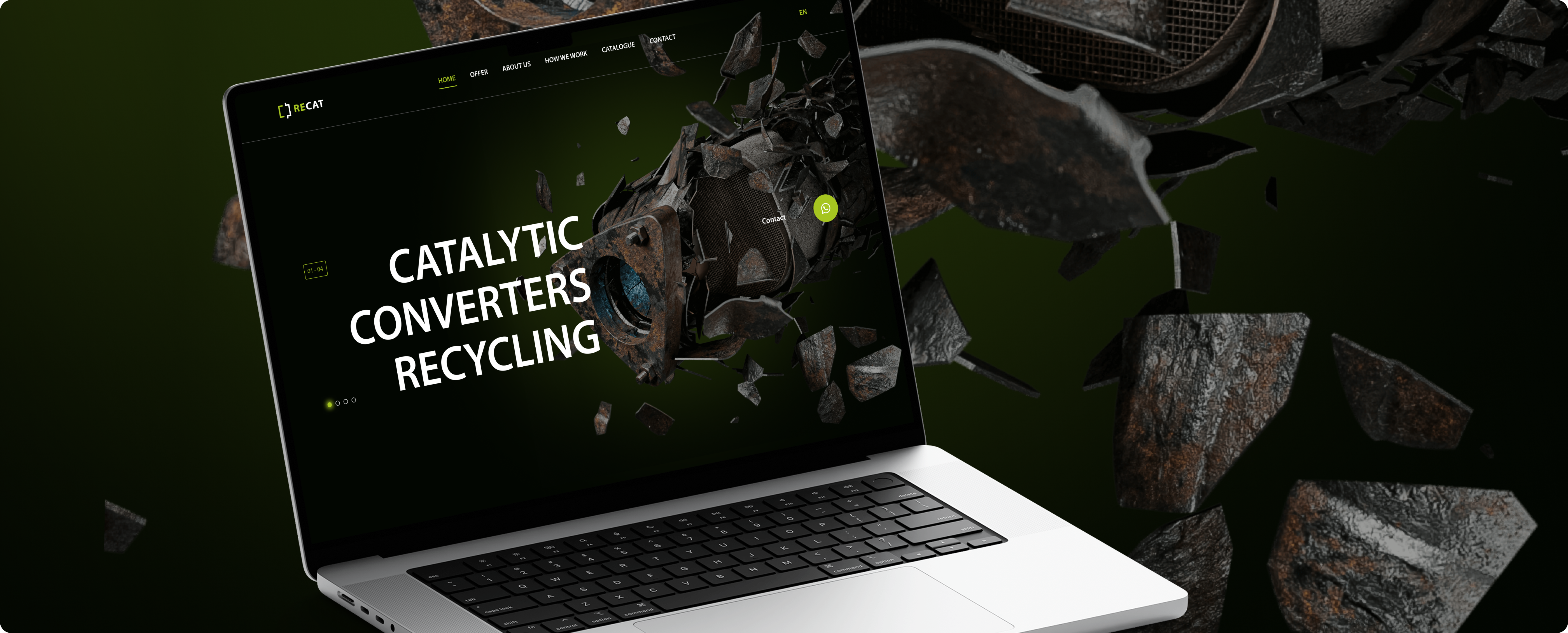
RECAT — Recycling Company Website
WhatsApp lead flow integrated with CRM for a technical B2B recycling service.
Year
2023
Role
Sole UI/UX Designer
Scope
UX Research · IA · UI Design
Type
Web · B2B
A strong offer, poorly explained
RECAT GmbH, part of the Elemental Group, is an environmentally focused recycling company operating in the Kraichgau-Stromberg region of Germany.
The goal of this project was to redesign the existing website to better communicate RECAT’s value proposition, improve lead generation, and simplify customer communication through more accessible and user-friendly digital touchpoints.
Core problem
RECAT’s buying process — piece-by-piece, bulk monolith, or metal account — was never explained. Suppliers had no clear entry point into a legitimate, well-established business.
The offer was clear enough. Getting in touch wasn't
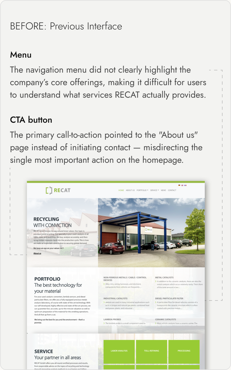
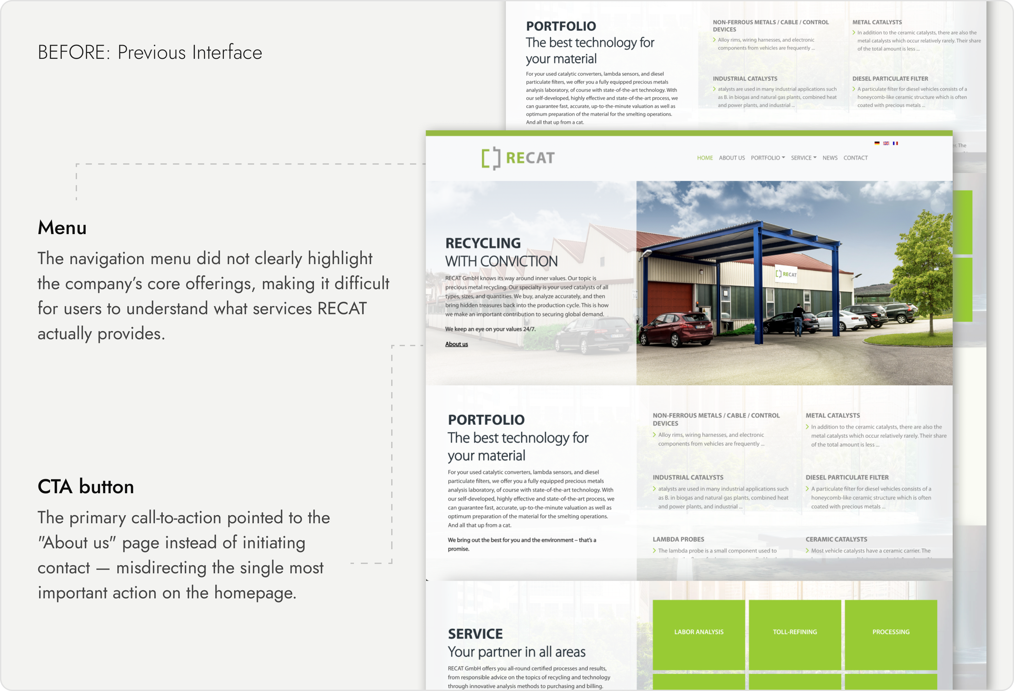
The old site buried a legitimate, well-established offer under cluttered layout and unclear navigation. Suppliers couldn’t tell at a glance which of RECAT’s buying models fit their volume, and the only way to start — a long contact form — was where most people dropped off before ever reaching a real conversation.
The objectives
Improve customer acquisition & service
The traditional contact form was supplemented with a WhatsApp contact button, providing instant messaging. All interactions are automatically stored in CRM for tracking and lead management.
Deliver a fresh and functional digital presence
Redesigned the information architecture, simplified navigation, and highlighted key services and documents. Users now reach the information they need in 2–3 clicks.
Key finding
Suppliers weren’t rejecting RECAT — they were abandoning the form before reaching a human.
None of the five competitors showed their pricing either
User & Market Insights — Target audience: B2B industrial clients and partners seeking recycling services. Reviewing 5 direct competitors surfaced a clear gap: none offered pricing transparency during the recycling process, and only one had a mobile app — an opening for RECAT to differentiate through transparency and digital accessibility.
Pain points
Pricing wasn’t published — quotes required contacting RECAT directly, and the old contact form meant waiting on email replies with no visibility into timing.
Old website issues
01
Cluttered layout and weak value proposition
02
Poor navigation and unclear hierarchy
03
Outdated visuals reducing credibility
The right channel was already open on their phone
Contact flow enhancement: traditional contact form supplemented with a WhatsApp contact button to provide users with instant communication options. Three contact options were considered: a redesigned multi-step form, a live chat widget, and WhatsApp. Live chat was rejected — it required staffing a real-time queue the company didn’t have. A redesigned form solved clarity but not response speed, which stakeholder interviews flagged as the bigger issue. WhatsApp won because it used a channel the target audience already had open, added zero staffing overhead, and let the same conversation flow straight into CRM without a separate live-chat integration.
BEFORE — Contact meant a form and an uncertain wait
Users could find contact details or fill out the form on the Contact page — but after submitting, there was no confirmation of response time, no indication anyone had seen it, and no way to know if or when RECAT would reply.

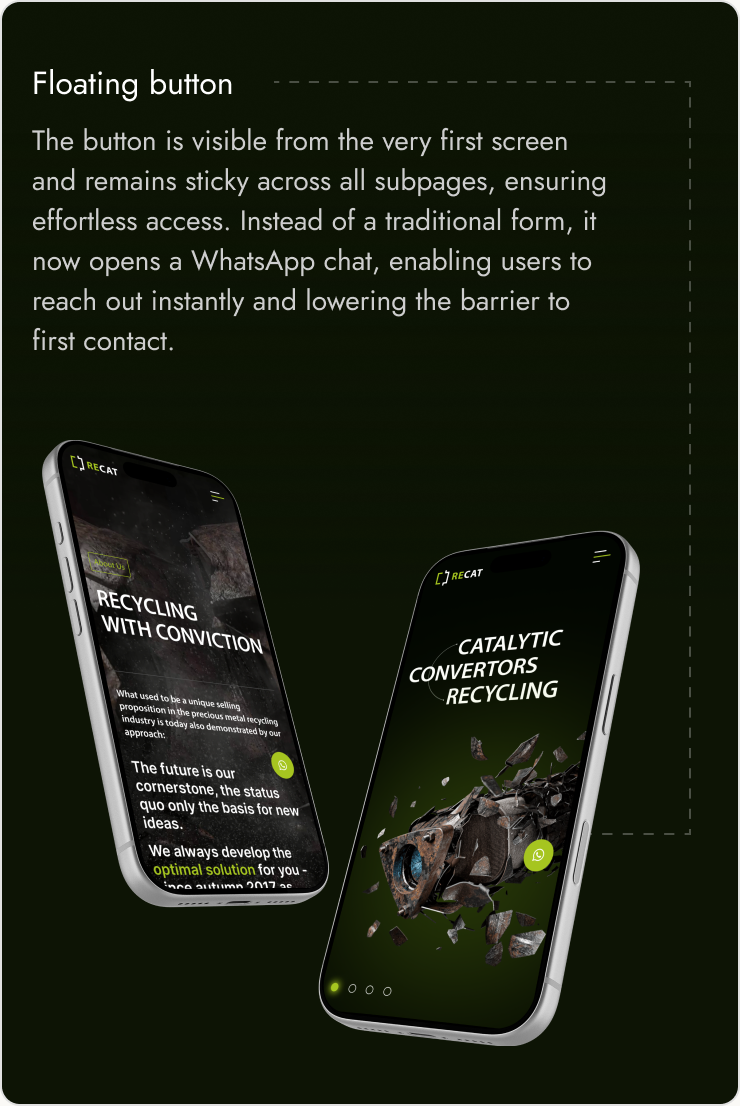
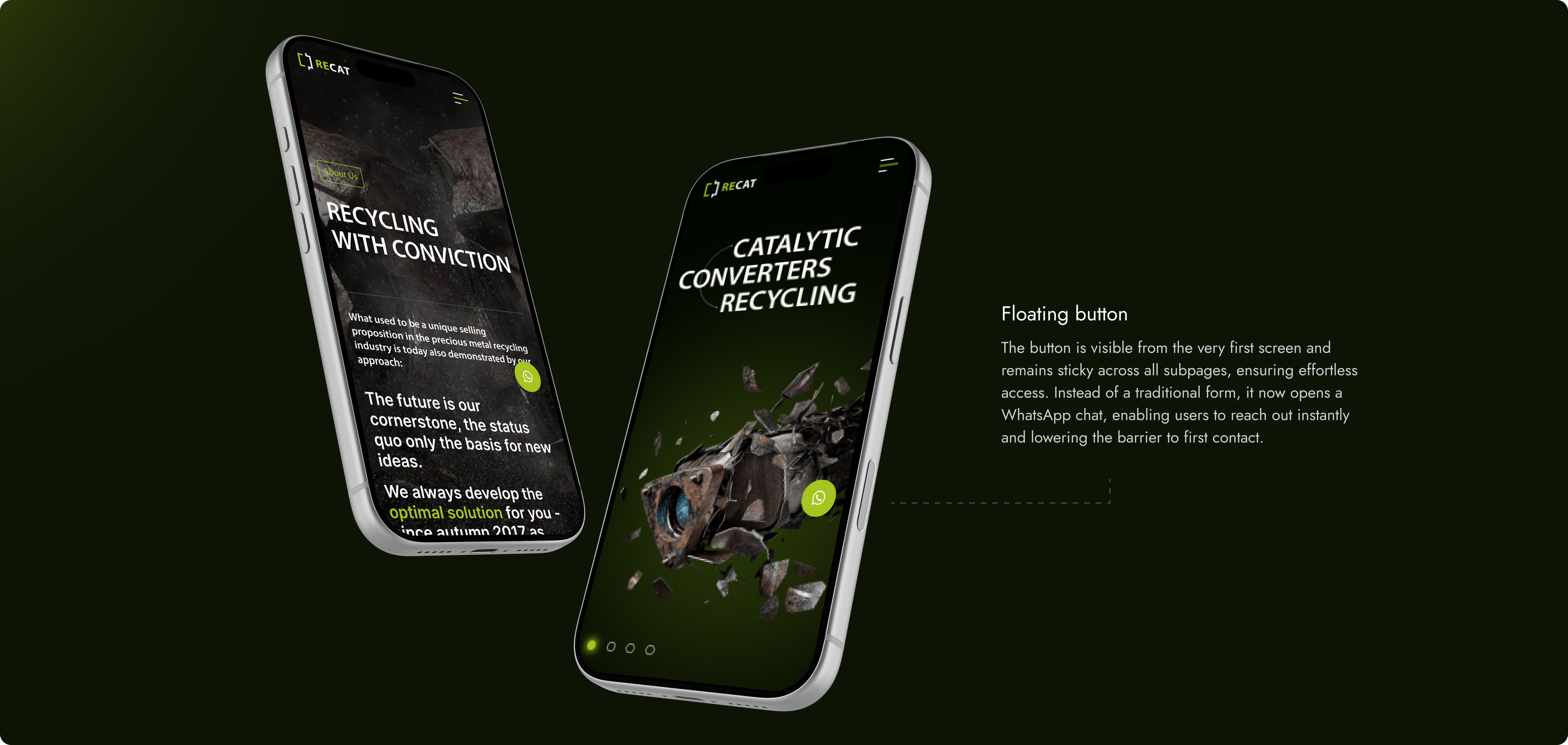
AFTER — WhatsApp added as a faster path alongside the form
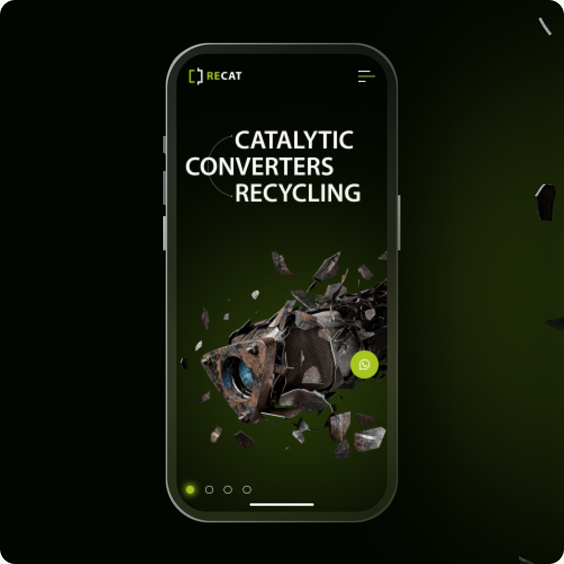
Instead of sending users to a separate contact page to find a way to contact RECAT, the new experience puts a direct WhatsApp conversation one click away.
Key improvements
01
CRM integration: all messages, including WhatsApp, are automatically stored for tracking and lead qualification.
02
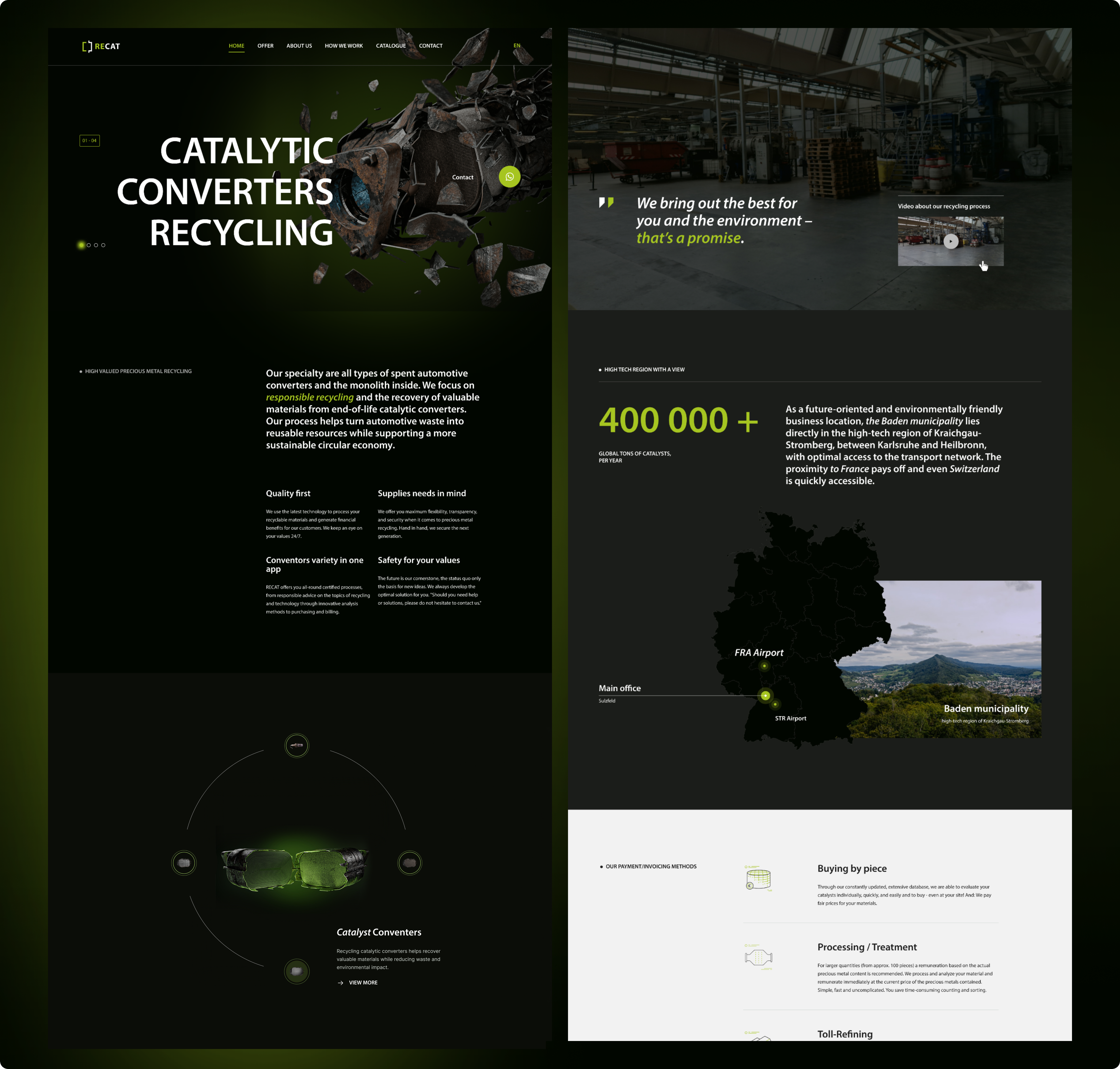
Clear value proposition on homepage: users immediately see services and benefits
03
Modern visual identity: reflects RECAT’s innovation and sustainability values.
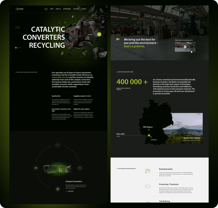
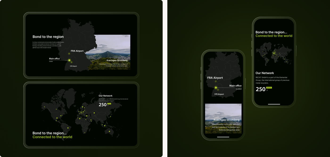
Extending the system beyond the homepage
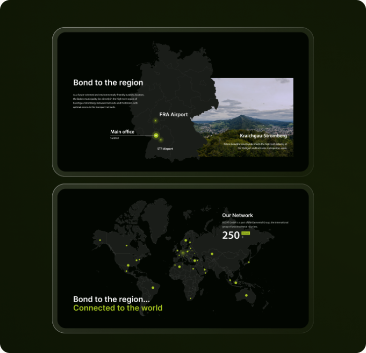
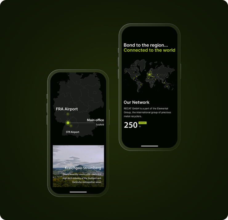
The same visual language and content clarity carried through to secondary pages — About Us, How we work, Offer, and downloadable resources — so suppliers get a consistent, credible experience wherever they land, not just on the homepage.
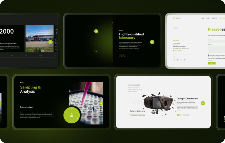
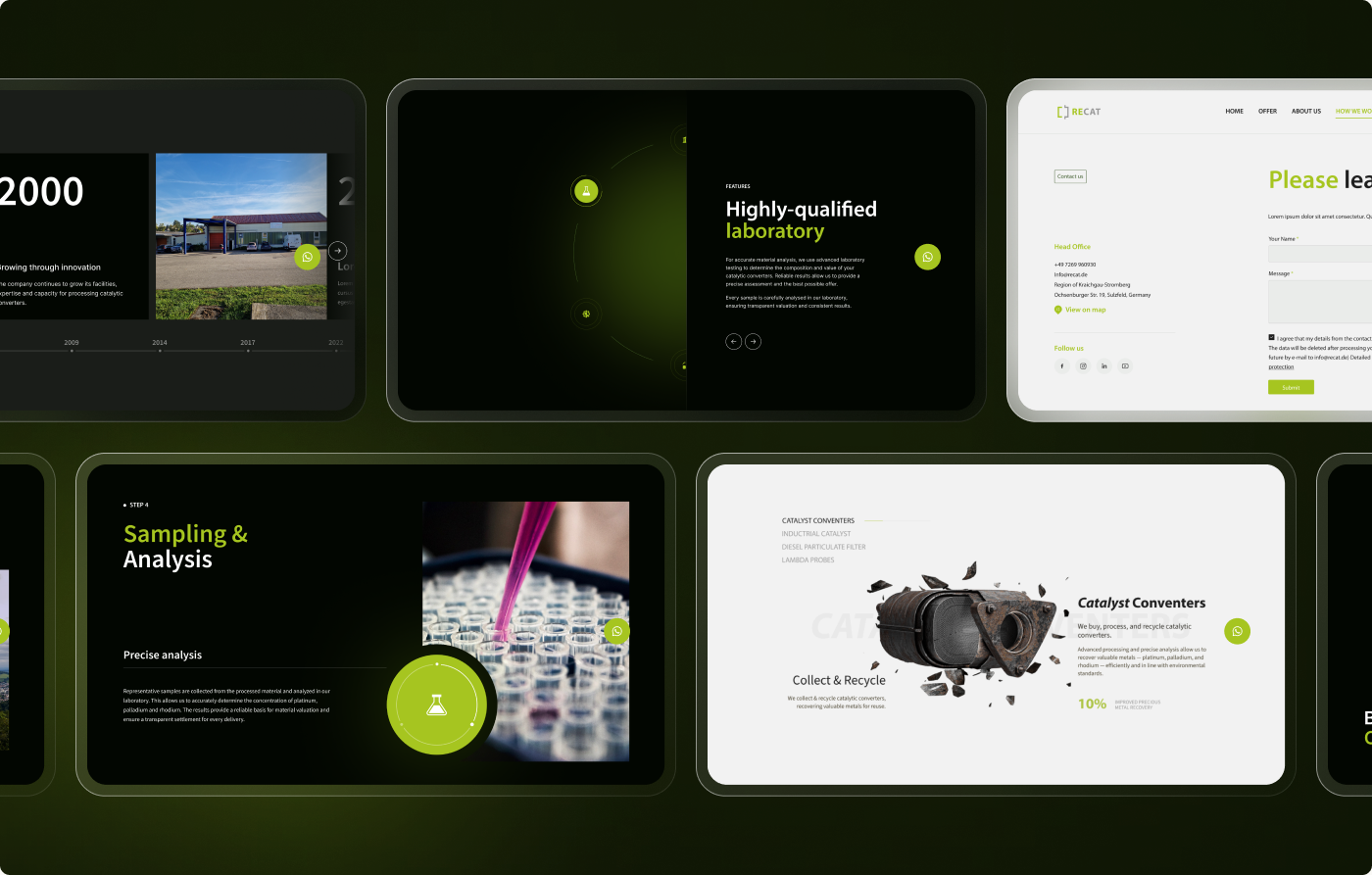
From a static website to a structured product experience
Based on the UX audit, competitive analysis, and the redesigned contact flow, the solution was designed to achieve: higher contact-initiation rate via WhatsApp compared to the previous static form, by lowering the barrier to first contact. Faster response times, enabled by instant messaging combined with CRM integration. Stronger homepage engagement, through a clearer value proposition and simplified navigation. Higher lead quality, as WhatsApp conversations typically surface more complete information than form submissions, making leads easier to qualify for follow-up.
01
New contact WhatsApp added, with zero live-chat staffing overhead
02
To reach key info 2–3 clicks, down from a cluttered menu
03
Evaluated 3 contact options before choosing WhatsApp + CRM
The best channel is the one they already trust
The biggest lesson from this project: the most effective solution isn’t always the most polished one — it’s the one that removes friction using a channel people already trust. WhatsApp beat a redesigned form and a live chat widget not because it was more sophisticated, but because B2B buyers in this industry already had it open.
If I could continue working on this project, I’d validate the approach with real usage data: contact-initiation rate via WhatsApp versus the old form, response times, and whether lead quality actually improved — the questions the note above leaves open.
next
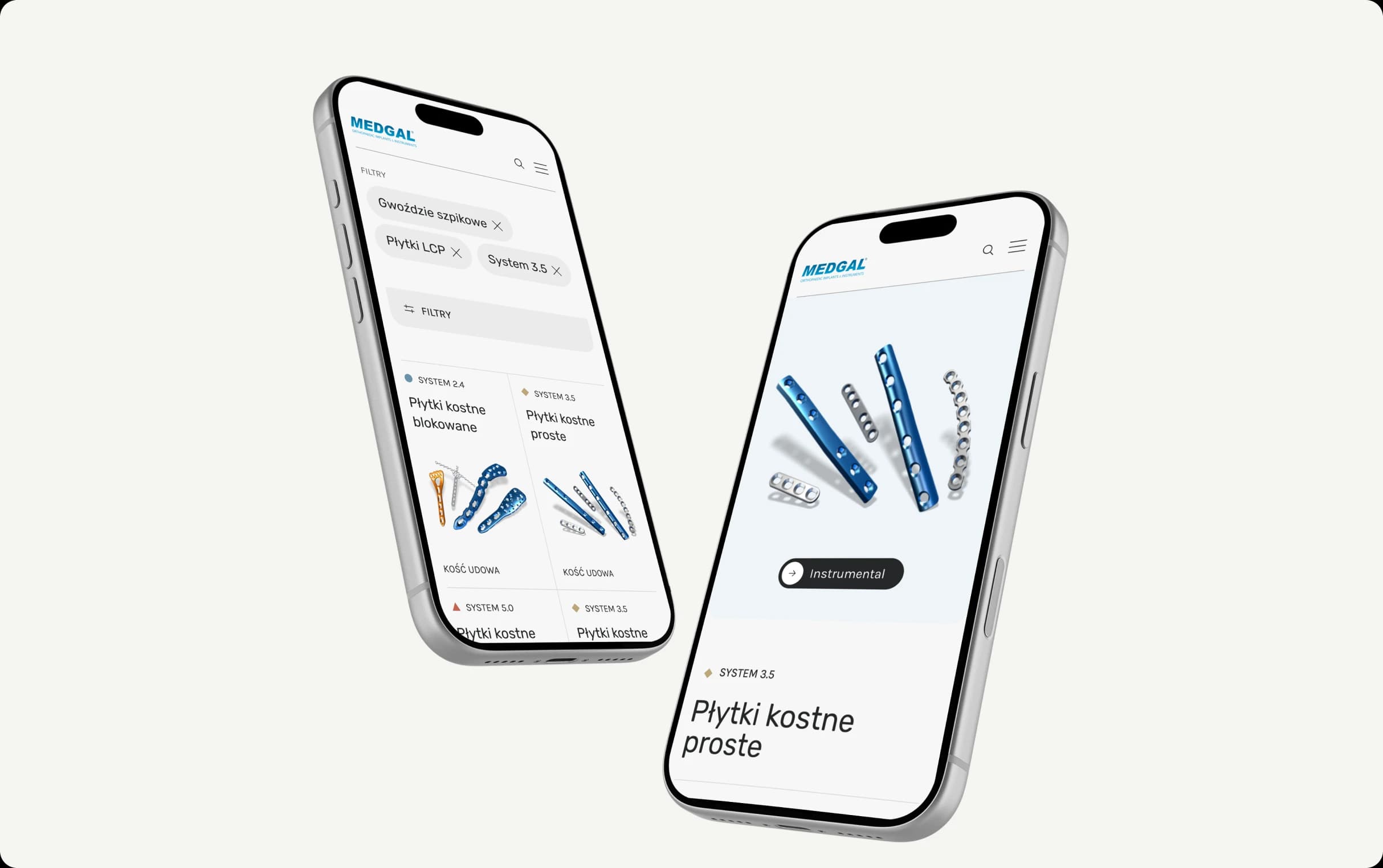
Medgal — Product Catalog & Information Architecture
Replaced a static PDF catalog with a searchable system for a large, technical product range.
Previous
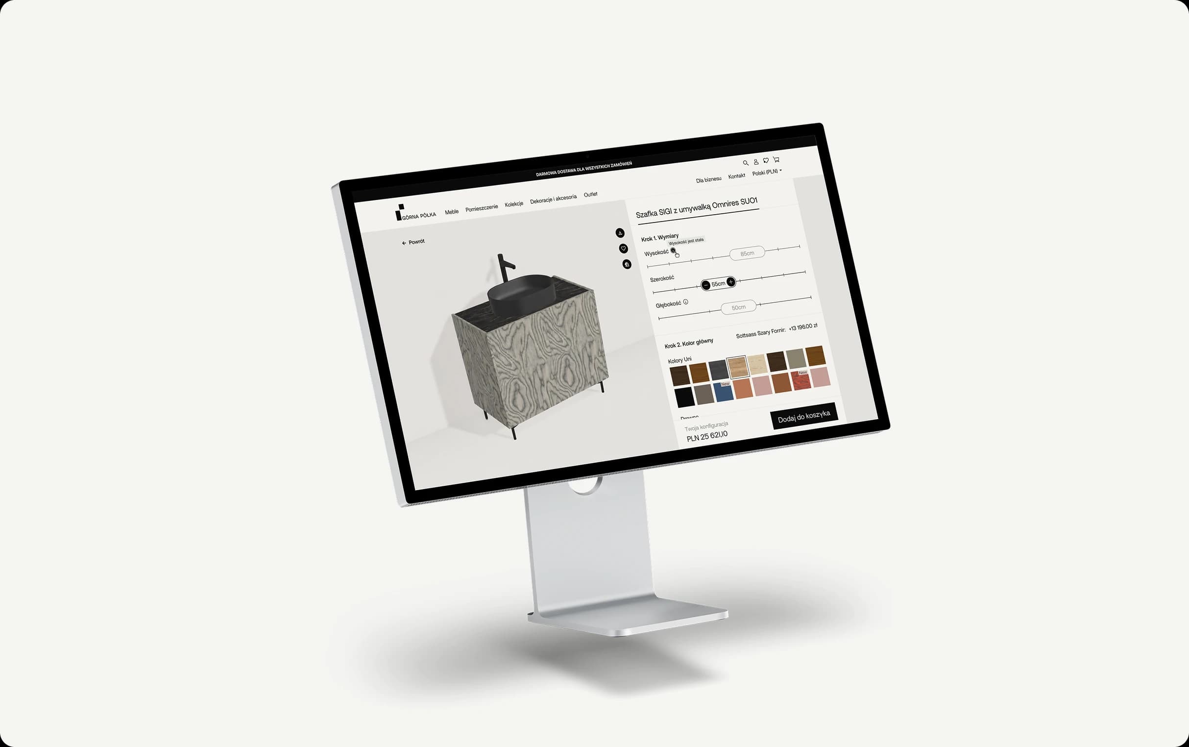
Górna Półka: E-commerce & Configurator
End-to-end redesign of a multi-market furniture e-commerce platform.
next
Medgal — Product Catalog & Information Architecture
Replaced a static PDF catalog with a searchable system for a large, technical product range.